Typewriter legacy / ugly layout requirements
I first used LaTeX some ten years ago. At the time I was impressed by the quality of the output and handy features like the automatic table of contents. Over the years I learned how to use LaTeX better and also understand why certain things are done a particular way. If one looks carefully enough into the documentation of the LaTeX packages, one often finds explanations which go beyond the how, the authors explain the why as well.
One marvelous example is the manual for the KOMA classes. It is written in German, so I fear that only some readers of this page can understand it. There are similar documents around if you look for them. The author describes the usage of his document classes and then has pages of rationale explaining the background and history of the typographical concept.
Shortcomings of the typewriter
One pattern that you often see is the legacy of the typewriter. A very long time ago, typesetting was done by professionals only. They would handle letters made from lead, it was a really tedious job. Since they had to learn how to operate the machinery, they also learned what good typesetting was about. One has to know many subtleties in order to produce stunning results.
At some point the typewriter was invented. Before the typewriter, one had to write a manuscript by hand and give it to a typesetter. That person would then arrange the letters on the page and produce a book out of that. With the typewriter, everybody could produce "typesetted" documents. The problem is that the typewriter perhaps came with an operation manual, but most people did not care to learn all the typographic subtleties. It is even worse: Even a professional typesetter cannot produce pleasing results with a typewriter. This is due to the inherent limitations of the system:
-
There is only one font, no way of making bold or italic letters. This means that one has to resort to other methods for emphasis. One common option is tracking, which is just spacing the letters a bit further apart. See an example. On the typewriter you can only make one full space in between the words. Then it looks like this:
This text has some t r a c k i n g with one full space in it.In real typography, one can insert smaller spaces in between the letters which makes it a subtle emphasis without tearing everything apart. With the right font, one can usually just use italic letters for silent emphasis.
Another way of emphasis is to underline words. This does not look very aesthetic and will catch the eye (loud emphasis). If the font allows is, one usually uses bold type for this.
-
Spacing between the lines is fixed to the ticks of the turning wheel. So one cannot freely adjust the line height but has can only use halves or quarters of a line. This does not seem bad at first. One wants every page to start at the same height and end at the same height. If you turn the page in a document, one does not want the type area to jump. This is hard to do with a typewriter if you have an odd number of lines on the page and would like to increase the spacing between the paragraphs by just a tiny amount to balance everything.
-
Typewriters have a monospaced font. That means that every letter has the same width. The font of this website is a sans-serif (or just sans) font. Here letters like "M" are far wider than "i". Words look balanced with it. However, in a monospaced font, they have the same width:
MiMi. This looks a bit unbalanced already.It is also harder to tell the words apart since the words fall apart themselves already. Even worse, sentences become harder to tell apart. This is the origin of the "double space after period" rule that many people use. It does make sense to use a slightly larger spacing between sentences than between words. Two spaces are too much. Since you cannot do 1.2 spaces on a typewriter, people just use two spaces. This looks ugly.
The monospaced font also means that all letters have to be as wide as the largest letter. Therefore every normal word with mixed letters will be wider than a sans or serif font will give you. That in turn gives you only few words before the line is filled.
The people who have grown up with a typewriter seem to have Stockholm syndrome with the horrible layout that it produces. One can see this in the layout requirements for submissions at universities. I am really happy that the physics department here does not impose any restrictions on the thesis you hand in, therefore I can apply all my knowledge of typography to make it as beautiful as I can.
In some other departments, especially law and psychology, this is not the case. In psychology there is the APA style to which pretty much all homework have to abide to. I know this because I tutor a LaTeX course three times a year and have a lot of people ask me to implement the requirements of their department.
Taking it apart
I have found a nice example (direct PDF) which gives an introduction to the APA style. To be honest, the document looks horrible to me. Let me take it apart:
-
The margins are supposed to be exactly one inch. This smells like a magic number somebody has pulled out of their hat. There is no reasoning why one inch will look good.
As Markus Kohm points out in the KOMA Script guide, the top and left/right margins should have the same aspect ratio as the page itself. The bottom margin should have twice the size of the top margin. All in all this leads to a balanced type area. Of course, this is not the only way to do it. I do my documents this way and I quite like the look.
I challenge you to take a good looking book and measure the margins. Are they all exactly one inch?
-
One should use the "Times New Roman" font in 12pt size. It is a Microsoft font, but that is the smallest problem. This font has been designed for the "Times" newspaper. In a newspaper one has really narrow columns. You want a very narrow font such that you can fit a couple words on a line. The number of characters per column is still small, so one can actually read it.
For a book or report, this is not the best font. It is too narrow if you use A4/letter paper and the narrow margins as mentioned. This results in a lot of words on a single line.
-
Since the lines are too long, the reader has the problem of reliably finding the next line. In a newspaper, that is never a problem. The longer the line, the more likely will one get lost. Then you have to backtrack and find the line you were in. This breaks the reading flow and is really bad.
A remedy is of course to use a wider font and larger margins. Alternatively one can go down the "double spacing" alley and just make the spacing between the lines larger. The result looks really torn apart, paragraphs seem to be a loose collections of lines now. I do not like it at all!
-
Now that the lines are too far apart, you get the problem that the running head cannot be distinguished from the body copy of your document. See page 4 of the sample APA document that I have linked. The running head just looks like another line on the page.
Nice solutions would be an increased distance between the running head and the body copy. One could draw a thin line below the running head (I do that) and/or typeset the running head in italics.
The APA style chooses the most ugly solution: making it all uppercase. They do not even bother to use small capitals as most fonts do not have it and most word processors probably do not support it.
Apparently the readers are not even supposed to know what a running head is. Therefore it is introduced with "Running head:" on the first page. Sigh. If you need to explain what some design element is, then this is usually poor design. Something like this should become clear from the context. I mean, you don't write "Heading:" in front of headings, right?
-
The title of the document is supposed to be typeset in the body copy font (12pt Times New Roman) on the title page. This makes it blend very well with everything else, you need to look twice to actually find the title. One of the worst things is the author list directly below. You need to infer from context where the title ends and where the authors start. So imagine I would write this paper:
| The superficial analysis of the F-test by | Ronald Fischer | Martin Ueding
Sure, one could even out the lines and make it this:
| The superficial analysis of the | F-test by Ronald Fischer | Martin Ueding
Still, I find that this format is really horrible. I would prefer something like this:
The superficial analysis of the F-test by Ronald Fischer
Martin Ueding
Then it would be clear where the title ends and the author list begins.
-
The word "Abstract" must not be written in bold. This makes it hard to find the abstract. At least it is centered.
The title of the paper is printed again on page 3. I just do not understand why this is the case. The way it is there, without any further spacing to the running head and the body copy, it does not look like a heading. It looks like a paragraph of text that is centered for some reason.
Do they really expect their readers to forget the title of the paper after turning two pages? What is the running head for, then?
-
The body copy itself is not even justified! Look at page 5 where there are no annotations. The left side does not look very calm because of the double linespacing. The right side looks really strange as there is no clear line on the right. Body copy should be justified to make the page appear more calm.
Justification needs hyphenation in order to become really good. This requires setting the correct language in your word processor.
Word documents
As an aside, I have heard that in a particular psychology department you have to hand in your essays as Microsoft Word documents. This is for the tutors such that they can use the built-in annotation tool to review the homework and sent it back.
When I was asked whether I could implement the APA layout, I said that I could. When I was then asked whether LaTeX could generate a Word document, I cringed and had to decline.
Word documents are a format for working on the document. It is not an exchange format for finished document. Compatibility issues aside, the tutor could just alter the text in the word document and one could not really see that. A friend of mine compared with to people writing exams with a pencil (outside the US ...). In Germany, pencil is not considered permanent and will not be taken seriously. Professors have said that they will erase everything written with pencils and give us a failing grade since we did not work on any of the problems.
So please, accept PDF files and get some software to annotate PDFs.
Direct comparison
In the law department, your text has to look like this:
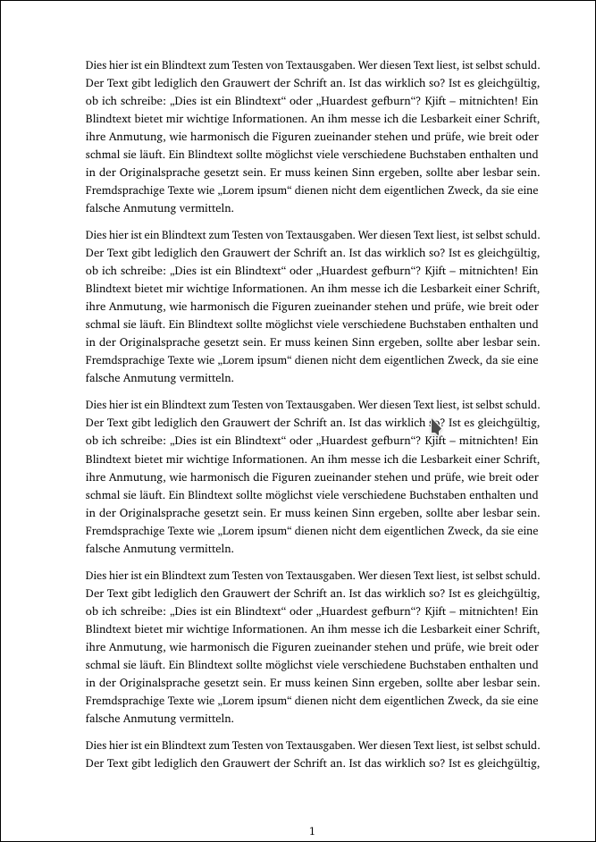
PDF file: bad.pdf
I find it quite hard to read. It is not as bad as the APA document linked to above since I have justified text (with character protrusion!) and with a linespacing of one-half. The font used (Bitstream Charter) is not as narrow as Times New Roman. Still the margins are strangely chosen. All in all it does not look very nice.
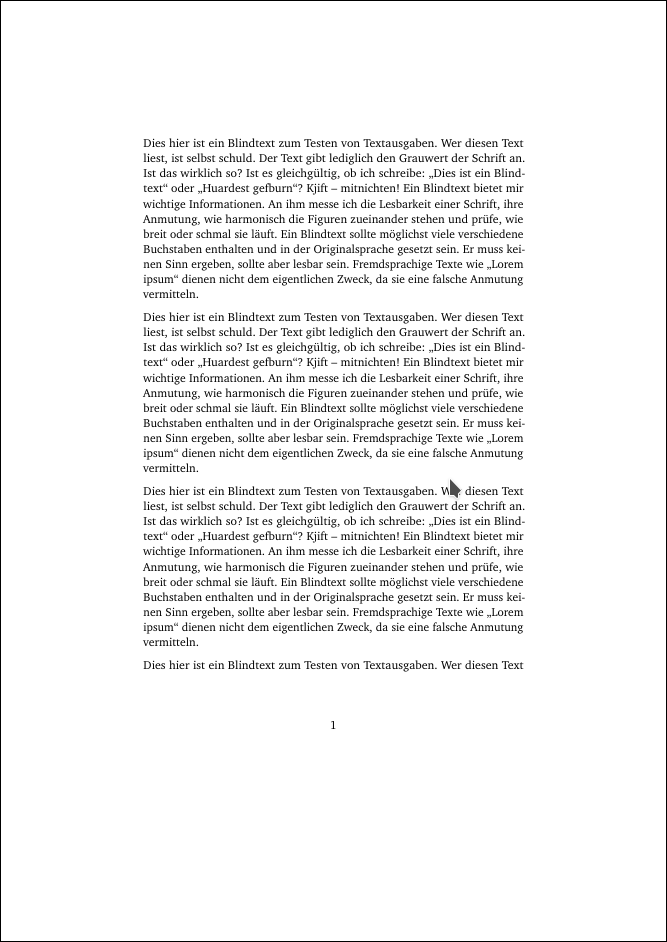
Letting KOMA Script compute the type area depending on the font automatically, we obtain this:
PDF file: good.pdf
Here the page does not look that torn apart. Also the margins look very luxury and it gives the whole page a calm setting. I like reading a document that is typeset this way. If you look closely, you find that the ratios of the margins match the ratios of the page as mentioned above.
The downside is that only three paragraphs fit on the page instead of four as before. Printing the document will need more pages. But why is this really a criterion? The number of pages is usually just limited because they want to limit the length of the thesis. It would be much better to measure pages with appropriate typography, even if that means 30% more pages. Even better would be to limit the number of words in a thesis.
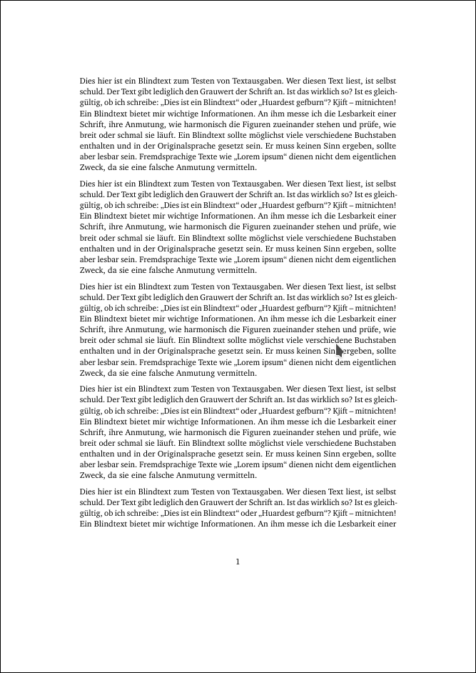
One can do a compromise. I have increased the type area such that four paragraphs fit on the page. The line spacing is just regular:
PDF file: compromise.pdf
I find this still better than the stuff mandated by the law department.
Interestingly enough, there are some professors who do not want this layout either. Sadly many departments have the typewriter legacy in their examination regulations and you will fail the course if you deviate from that.


