Survey of Plot Systems
I present a few different plot libraries for Python and R and show my favorites.
During my years as a physicist I have created a bunch of plots from data. My first experience was with xmgrace in 2011, which was already outdated back then. I tried gnuplot and later GNU Octave. I've made the transition to Python and Matplotlib, where I stayed several years. For my PhD I started using R, but skipped using base R plotting and directly went for ggplot, which still is my favorite plotting library as of today. My first industry job got me back to Python, where I tried to find something like ggplot. The first candidate was seaborn but I just didn't like it. It wanted to be ggplot for Python, but it is not. I eventually found Altair and was amazed. The interactivity with Vega-Lite is super cool. Bokeh provides even nicer interactive widgets, but the plotting interface in Python does not feel as declarative.
In this post I want to go through a somewhat simple plotting example and show how the different plotting libraries do that. We will be using the Anderson's Iris data set as that is built into R and Python libraries already and makes the examples reproducible without any extra data files.
The dataset has 150 entries and describes the sepal and petal lengths of three different species of iris flowers.
| Sepal Length | Sepal Width | Petal Length | Petal Width | Species |
|---|---|---|---|---|
| 5.8 | 2.7 | 4.1 | 1.0 | versicolor |
| 5.4 | 3.4 | 1.5 | 0.4 | setosa |
| 5.5 | 2.3 | 4.0 | 1.3 | versicolor |
| 5.5 | 3.5 | 1.3 | 0.2 | setosa |
| 5.8 | 2.7 | 5.1 | 1.9 | virginica |
| 5.2 | 4.1 | 1.5 | 0.1 | setosa |
| 6.0 | 3.0 | 4.8 | 1.8 | virginica |
| 5.2 | 3.4 | 1.4 | 0.2 | setosa |
| 6.5 | 2.8 | 4.6 | 1.5 | versicolor |
| 4.7 | 3.2 | 1.6 | 0.2 | setosa |
We will be just plotting the sepal width vs. length as a scatter plot and then have three different colors for the species. I will start off with my favorite libraries and then list the other ones.
ggplot in R
My favorite is created with ggplot. The plot looks clean, there are no points crammed to the boundary of the axes. The legend has a title and is placed outside, so it does not hide any of the data points. The color palette is nice.
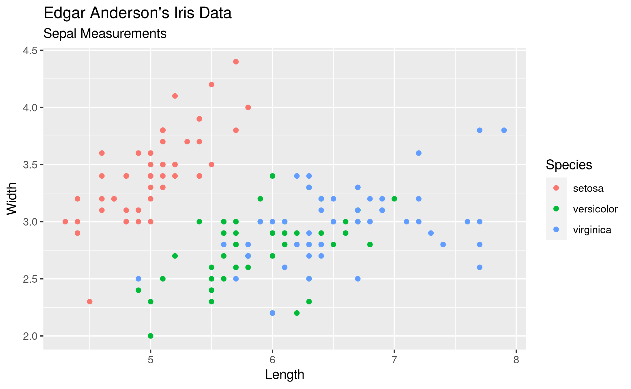
The needed code is quite short and easy to remember, I find. It is purely declarative, there is no logic needed. We say that we want to have a plot of the iris data frame. Then we have aesthetic mappings with aes() and just map the columns of the data frame to visual elements, namely the x-axis, y-axis and colors. We want to have these visualized with the point geometry without any special options. Finally I want some labels, so I specify them with labs(). Storing the plot as a PNG file is dead easy.
library(ggplot2)

ggplot(iris,
       aes(x = Sepal.Length,
           y = Sepal.Width,
           color = Species)) +
  geom_point() +
  labs(title = 'Edgar Anderson\'s Iris Data',
       subtitle = 'Sepal Measurements',
       x = 'Length',
       y = 'Width',
       color = 'Species')

ggsave('plotsurvey-ggplot.png')
If we want to display the petal lengths, that is a very simple adjustment. We can also exchange color for shape to make it a color-blind-friendly plot. We could even double-encode the species with color and shape if we wanted.
Altair with Python
Altair produces interactive plots with Vega-Lite. There there is a point on the boundary. The legend is outside, so it does not overlap with the points. One can make the plots interactive or leave them static.
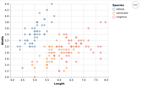
This plot needs a really low amount of code. We just specify the data set, add marks and specify the encoding, just like one would do in ggplot. The only addition is that one has to explicitly disable the absolute zero in a scale, but that is a good thing for a lot of use-cases.
from bokeh.sampledata.iris import flowers
import altair as alt

(
    alt.Chart(flowers)
    .mark_point()
    .encode(
        x=alt.X('sepal_length', title='Length', scale=alt.Scale(zero=False)),
        y=alt.Y('sepal_width', title='Width', scale=alt.Scale(zero=False)),
        color=alt.Color('species', title='Species'),
    )
    .interactive()
)
My current favorite in Python is Altair because it produces very nice plots with the best interface that I have seen so far. It seems to rival ggplot in terms of declarative power. Advanced features like violin plots are not directly supported, and also I couldn't find dodge or jitter. Still it does a very good job for most of my needs.
Bokeh with Python
Bokeh generates interactive plots in JavaScript but is completely controlled by Python. Their idea is that you don't have to write JavaScript and they do it for you. The resulting plots have really nice interactivity, one can add even more tools if one wants to.
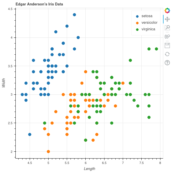
There are multiple modes to use it, one seems to be the standard where one just supplies two vectors of X and Y data and picks a specific color, like with Matplotlib or Base R. Instead I prefer to use the data source mode, where one can specify column names. Using this method, the plot looks rather similar to the one that we had with ggplot.
from bokeh.plotting import figure
from bokeh.sampledata.iris import flowers
from bokeh.models import ColumnDataSource
from bokeh.transform import factor_cmap

source = ColumnDataSource(flowers)

p = figure(title = "Edgar Anderson's Iris Data")
p.xaxis.axis_label = "Length"
p.yaxis.axis_label = "Width"

p.circle(source=source,
         x = "sepal_length",
         y = "sepal_width",
         color=factor_cmap("species", "Category10_3", flowers["species"].unique()),
         legend_field="species",
         size=10)

bokeh.plotting.show(p)
Matplotlib with Python
Matplotlib produces really great quality graphics, but it is a rather low-level interface. The plot looks reasonable, has decent colors, no points sticking to the axes limits. The legend overlaps with the data, which is not that nice.
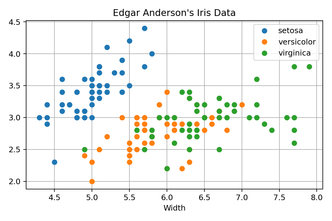
In order to get the dataset in Python, I use it from Bokeh. It is just a Pandas data frame, so no magic there. As far as I know, there is no declarative way to use it, so one rather has to group the data by species and then call plot() once for every subset. There is a data argument, but that only seems to help with X and Y data, not with the attributes. It is just a coincidence that the colors get cycled through and not the shapes. If we wanted to do that with shapes, we would have to do a lot more work.
import matplotlib.pyplot as pl

from bokeh.sampledata.iris import flowers

pl.clf()
for s in flowers["species"].unique():
    subset = flowers.loc[flowers["species"] == s]
    pl.plot(subset["sepal_length"],
            subset["sepal_width"],
            marker='o',
            linestyle="none",
            label=s)
pl.title("Edgar Anderson\'s Iris Data")
pl.xlabel("Length")
pl.xlabel("Width")
pl.grid(True)
pl.legend(loc='best')
pl.tight_layout()
pl.savefig('plotsurvey-matplotlib.png', dpi=150)
pl.show()
Seaborn with Python
Seaborn also produces nice plots that are basically just instrumented Matplotlib plots.
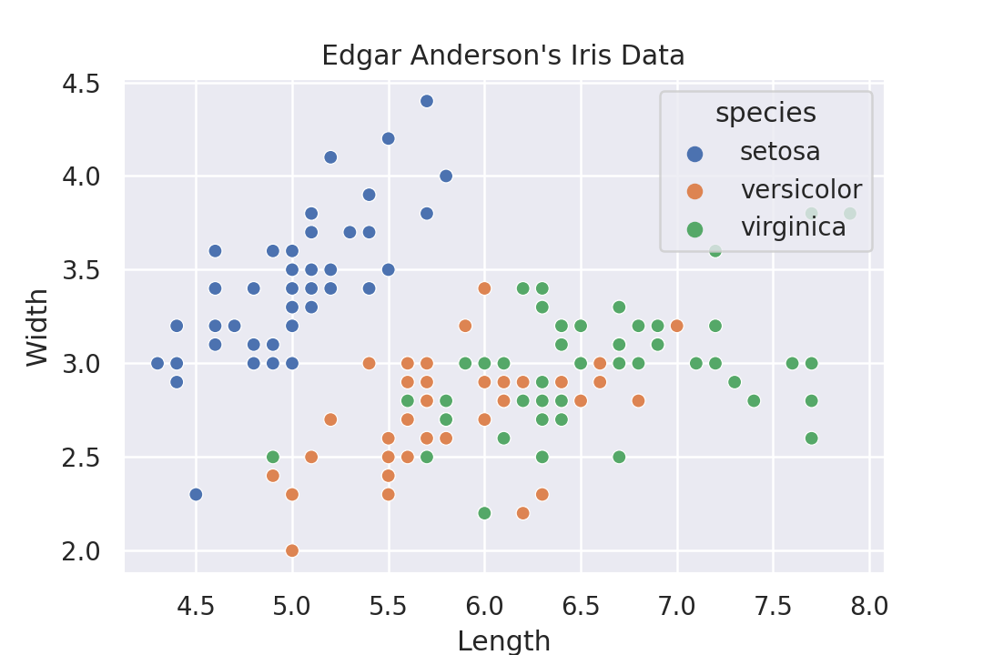
The syntax seems to be somewhat declarative, and somewhat not. There are different functions that one has to call depending on the results that one wants. This is a bit strange, one doesn't have this in ggplot or Altair. There one can either choose points or boxplot as marks and it gives a completely different plot. But with Seaborn one has to select a different function. These functions have a similar API, but it doesn't feel as purely declarative as Altair does.
import seaborn as sns

flowers = sns.load_dataset('iris')
sns.set_theme()

g = sns.scatterplot(
    data=flowers,
    x='sepal_length',
    y='sepal_width',
    hue='species'
)
g.set_title("Edgar Anderson\'s Iris Data")
g.set_xlabel('Length')
g.set_ylabel('Width')
g.get_figure().savefig('plotsurvey-seaborn.png')
Base R
The R programming language also comes with plotting capabilities, but I don't like these very much. The functions are low-level, but the plots look pretty decent afterwards. In this example I already dislike that the legend is part of the plot. Otherwise the manually chosen colors are not perfect, but it is okayish.
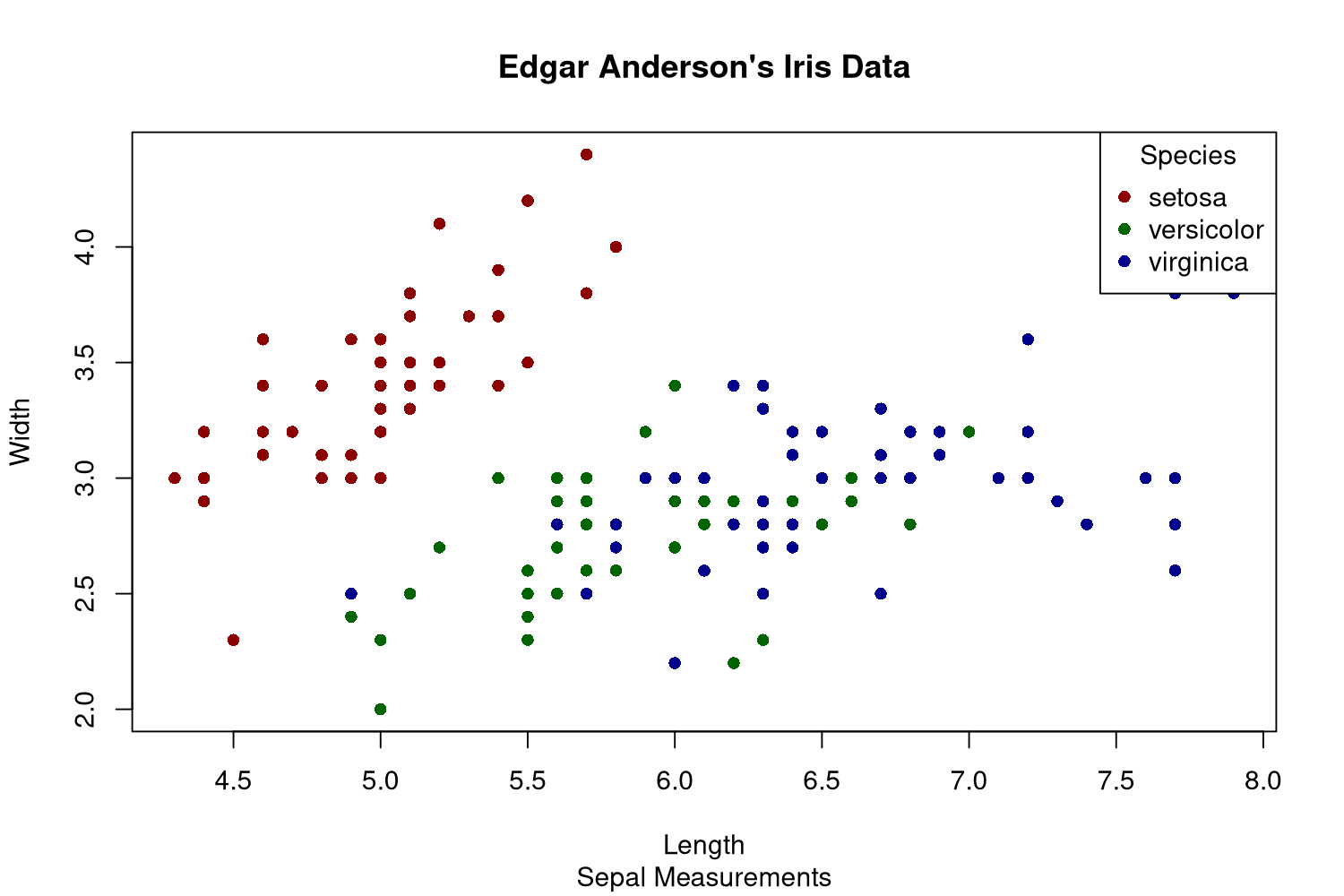
First of all, base R has the concept of plotting devices. We cannot declare the plot and then generate various files with it, we need to open the file first and can then only plot into that. This feels like an outdated way of doing it, likely because base R is pretty old by now. The png() function opens this file, and dev.off() closes it in the end.
The plot() function will plot the given data, and one needs to specify whether it is a line or scatter plot using the type argument. There is no automatic mapping from some variable to colors, so we need to build that on our own with a simple vector with named elements. This way one can just map the species to color names. Fortunately plot() can vectorize over the col argument. As I want filled circles, I need to specify that I want plot shape 16 via pch. I always have to look these up as I almost never use these numbers.
The legend needs to be created manually by specifying the names and values that should be displayed.
png('plotsurvey-base-R.png',
    width = 1500,
    height = 1000,
    res = 180)

colormap <- c('setosa' = 'darkred',
              'versicolor' = 'darkgreen',
              'virginica' = 'darkblue')

plot(x = iris$Sepal.Length,
     y = iris$Sepal.Width,
     type = 'points',
     col = colormap[iris$Species],
     pch = 16,
     main = 'Edgar Anderson\'s Iris Data',
     sub = 'Sepal Measurements',
     xlab = 'Length',
     ylab = 'Width')

legend(x = 'topright',
       legend = names(colormap),
       title = 'Species',
       pch = 16,
       col = colormap)

dev.off()
This is of course usable, but it is not as nice as the declarative approach that ggplot offers.