New Tab Design in Firefox 89
Firefox 89 has a new design for the tabs, and I find it less usable than the previous version. With a different theme one can get back the contrast.
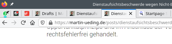
Today I received Firefox version 89 on my laptop, and I let it choose the system theme. On my KDE machine, it now looked like this:
Can you see which tab is active? I really have to closely look to see the dark gray border around the active “tab”, which is just a button.
This is much worse than the default that it had before with actual tabs. It would have a blue border on top of the tab bar, and the shades of gray were more differentiated.
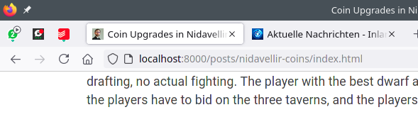
If one takes the “light” theme, the tabs are a bit better to distinguish, but then the address bar lacks contrast.
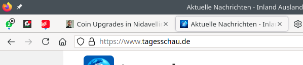
So I ended up installing the Classic Contrast theme, which indeed gives a lot of contrast there:

The tab bar has superb contrast, one can read the font, and the address bar also has plenty of contrast.
Lately I really don't get what the Firefox people do with the browser. Adding a bunch of nonsense features like “Pocket”, or adding “Tab Candy”/“Tab Panorama” only to remove it in a later version. I do like that they have significantly improved their process and rendering management. But a lot of the updates really feel like a step back.