Counting Passing Cars
Using an audio recording of the cars passing by my window, I try to extract the number of cars that have passed by. I introduce the waveform and spectrum, construct a filter bank, find peaks. In a second part I play around with dimensionality reduction algorithms.
I have a street in front of my condo, and cars regularly drive by. I was wondering how much traffic that street has. Sometimes I read something like “street with 10.000 cars per day” and wonder how much that really is. To get a sense of proportional I wanted to count the cars on my street.
Just taking a flipchart, pencil, lawn chair and counting them would be possible, but totally labor intensive. And I would lack the exact timing of each car, I couldn't see whether it is Poisson distributed. So there are a lot of bad reasons to do this. I somehow have to make a computer count this. For this I would need a data stream.
Data gathering
The first idea of most people (including me) would be a camera and do it with movement detection. This would introduce a lot of additional problems:
-
As the times of day change, the lighting changes. Especially at night there is nothing I could do, I don't have an infrared camera. The headlights of the cars might be sufficient, but I would likely have to analyse that differently than during the day.
-
The video stream would create lots of data, and I would have to boil that down. Perhaps I could use some surveilance camera app on my phone to only extract some snippets, but I would have to seek out such an app, test and calibrate it.
-
Privacy is a concern, one is not allowed to surveil public spaces. A little video is fine, but doing that for potentially a week doesn't sound really good.
So instead I thought that audio was going to be easier. It would not be sensitive to the time of day, would not record license plates, faces or anything like that. The amount of data is also much smaller, for an initial take of 75 minutes I have 370 MB. That is still good to manage. Video would be a few GB.
First look at the data
For this project I will use Python and the SciPy library. It has some signal processing, most importantly the spectrogram function.
First we need to load the audio data.
filename = 'Aufnahme_9.wav'
rate, data = scipy.io.wavfile.read(filename)
Waveform
The content of the file is the amplitude as a time series. The physical sound wave amplitude can be described as a continous function of time, $a(t)$. In the audio recording that I have, we don't have continous time because that would need infinite data to describe. Instead it is only sampled with a rate of $r = 44100\,\mathrm{Hz}$. This means that we have discrete time values $t_i$ and only have the sampled values $a(t_i)$ which one usually just denotes at $a_i$.
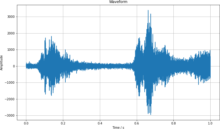
We can visualize this data $a_i$ for a second of the data. We see how the amplitude varies greatly over the period.
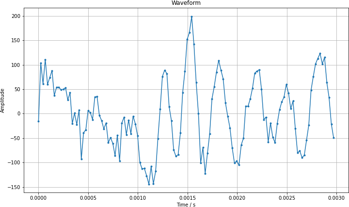
Zooming in by a large factor, we can see the discrete nature of the recording. I have marked each data point with a point and connected them as a visual aid.
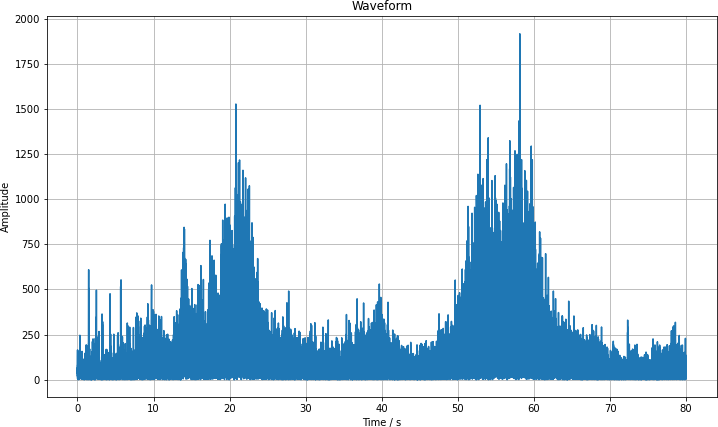
This way of looking at the data is not that helpful to find out whether cars have passed. Let us take a look at a section from second 1120 to 1200 where three cars have passed. I have taken the absolute value of the spectrum as it is symmetric and we can see a bit more detail in this way. I know from the analysis that we are going to look at in a moment that cars have been passed by at seconds 22, 54 and 59. Once you know that, you can find the humps and also distinguish the double hump on the right. But it doesn't really look that robust.
This way of looking at the data is at complete loss for the frequency, and we can extract much more from the data.
Spectrogram
We have the continuous amplitude $a(t)$. There is the concept of the Fourier transform, which converts a function of time into one of frequency, abstractly written as $$ F(a)(\omega) = \int_{-\infty}^{\infty} \mathrm d t \, a(t) \exp(-2 \pi \mathrm i f t) \,. $$
This form isn't very helpful for us, because it gets rid of all time information. So instead we chunk the time into small pieces (say 100 ms) where we expect the noises to stay the same and do a Fourier transform of those. In this way we still have time information, but we also gain access to the frequency information.
Using the same chunk of data that I have shown above, we can use SciPy to perform this Fourier transform for us and produce the spectrogram
fft_length = rate // 10
f, t, Sxx = scipy.signal.spectrogram(
    data[rate*1120:rate*1200],
    rate,
    window=scipy.signal.blackman(fft_length),
    nfft=fft_length,
    mode='magnitude'
)
db = 10 * np.log10(Sxx)
And then I plot it using Matplotlib.
pl.figure(figsize=(25, 7))
pl.pcolormesh(t, f, db, shading='auto', cmap='turbo')
pl.colorbar()
pl.xlabel('Time / s')
pl.ylabel('Frequency / Hz')
pl.title('Spectogram')
pl.savefig('spectrogram.png', dpi=150)
pl.show()
The resulting image shows the general structure of the data. If you haven't seen a spectrograph before, here is what it means: On the horizontal axis you have the time as it passes by. On the vertical axis is the audio frequency. The coloring is the sound intensity. The red areas mean that at that time and that frequency there was a large contribution. Wide structures mean that the noise was longer, narrow bands mean short sounds. If they span a lot of the height, a lot of frequencies contribute, that is typical for static noise. And if they are not tall, it means it is more focused in frequency. A perfect musical note would only have one frequency.
You can see that there are three cars which passed by, one at second 22, the other at 54 and 59. The car noises extend over like 10 s, which is the time it needs to pass by the window. It also spans a lot of frequency, which is plausible from the engine and tire noises.
But what are those short noises between 3000 and 5000 Hz? I listened into the audio file and found that those are chirping birds. Using Audacity I isolated a section without cars and looked at the spectrum there, it also has this large contribution between 3000 and 5000 Hz.
In some patches there might be additional sources of noise, like people talking, somebody moving in one of the condos. This is something that we will have to deal with at some point.
Feature extraction
The moving cars seem to be pretty clearly identifyable. The noises last for 5 s to 10 s, they cover a broad range of the spectrum and always have this ramping up and down. There might even be a 5 % doppler effect from a car passing with 30 km/h, maybe we can resolve that. But for a computer determination there is still too much noise there.
Gaussian filter
For this application I do not care about quick changes in the spectrum, I do not want high temporal or frequency resolution. Therefore I apply a Gaussian filter to smooth the spectrum a little bit.
db_smooth = scipy.ndimage.gaussian_filter(db, sigma=(5, 10))
After that the humps from the passing cars are much better to see.
Individual frequencies
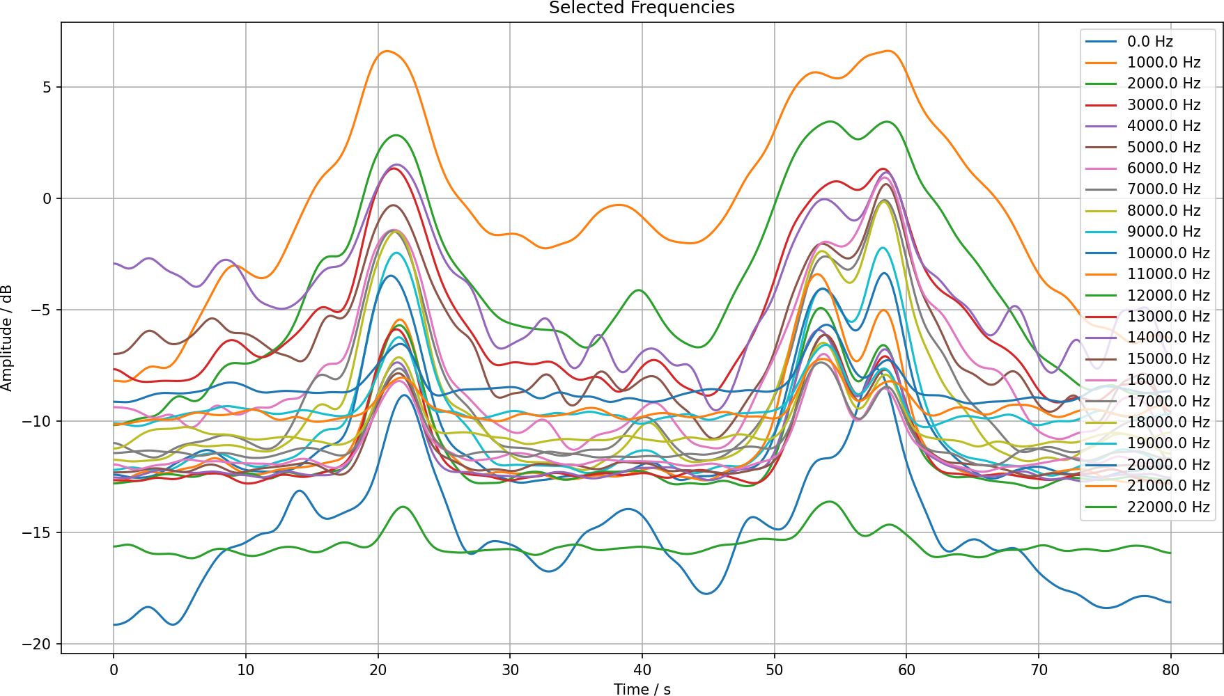
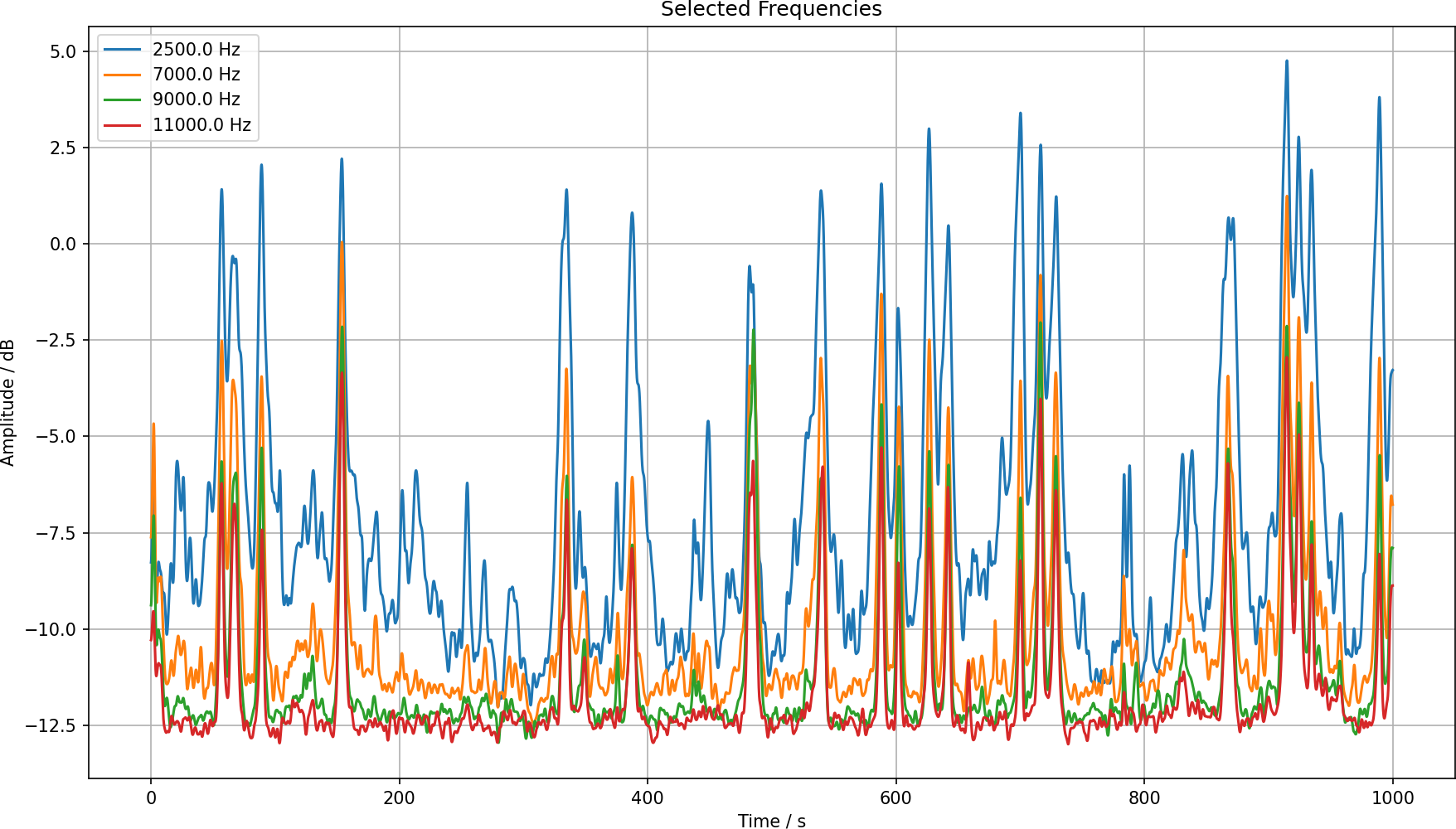
We can also look at some cross sections of the spectrum, say in steps of 1000 Hz.
This looks reasonable. We can separate the two different humps using a couple of these frequencies. Also looking at the spectrogram plot we can identify the frequencies which are most promising to detect cars.
It seems that the 11 kHz is the one with the cleanest signal for this project. We could say that if the amplitude is over –7 dB we have a car. We just need to count the humps.
Test with more data
I now take 1000 seconds of data and generate the same plots as before. The raw spectrogram looks like this:
Then with the smoothing we get much better signal-to-noise ratio:
And looking at the most promising frequencies, we have this:
Finding peaks
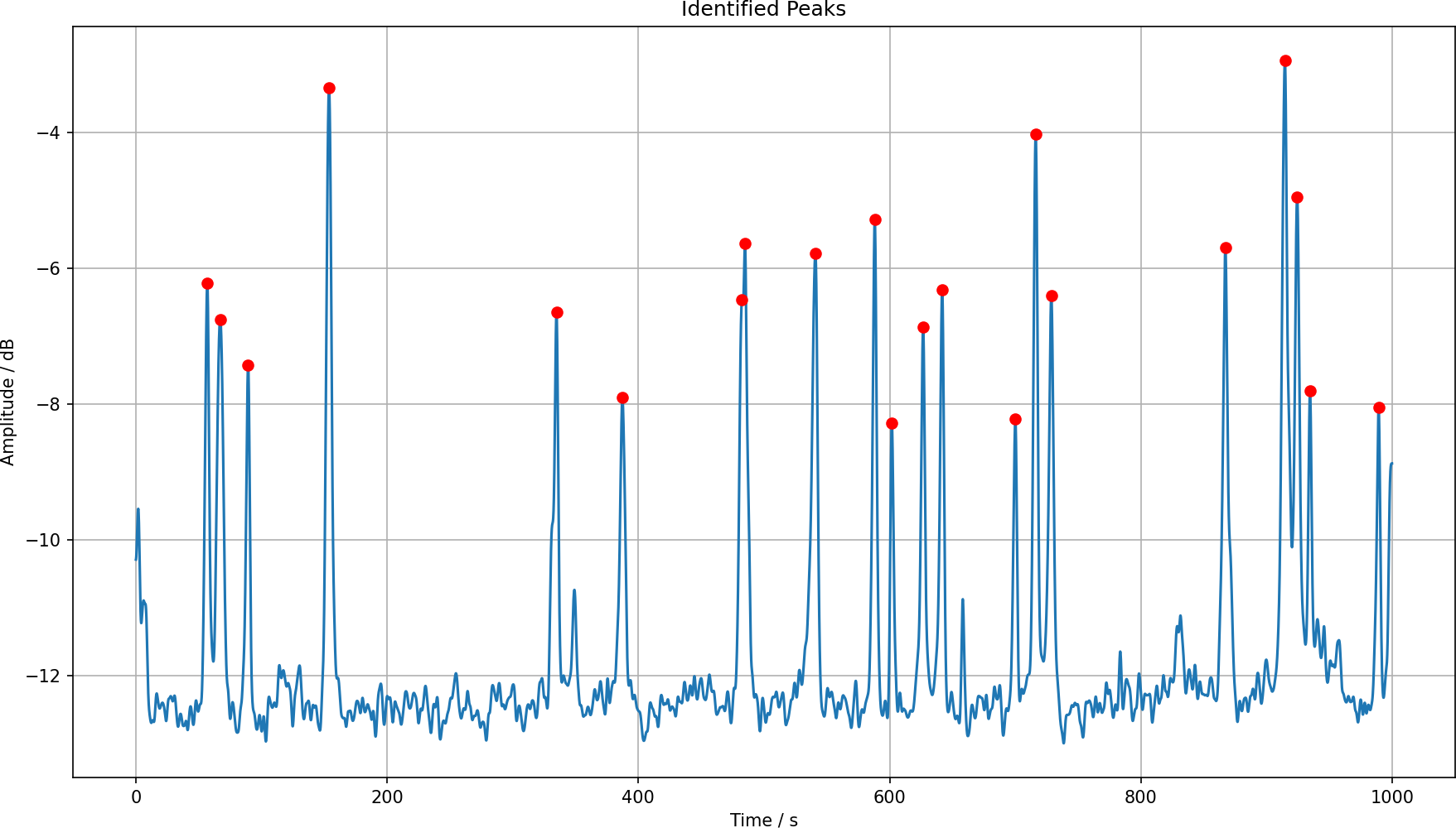
We just need to find the peaks. I vaguely recalled doing something like that in a physics lab course years ago, and the find_peaks function is still there. We know that the peaks have to be apart at least a second. Cars traveling travel here with around v = 10 m/s, their length is like 5 m and they have some safety distance of around 5 m. So they are spaced at least a second apart. I have used 15 FFT samples, that is 1.3 s.
I have just used the 11 kHz frequency and then used the function to find the peaks with a threshold of –9.
peaks, properties = scipy.signal.find_peaks(
    x=db_smooth[1100, :],
    height=-9,
    distance=15,
)
We can plot that frequency contribution and the found peaks.
pl.figure(figsize=(12, 7))
pl.plot(t, db_smooth[1100, :])
pl.plot(t[peaks], db_smooth[1100, peaks], marker='o', color='red', linestyle='none')
pl.grid(True)
pl.xlabel('Time / s')
pl.ylabel('Amplitude / dB')
pl.title('Identified Peaks')
pl.tight_layout()
pl.savefig('peaks-11khz.png', dpi=150)
pl.show()
This gives us this nice looking plot:
And we can compare that to the smoothed spectrogram plot and see that it indeed finds the peaks.
Those are 20 peaks in around 17 minutes, so that is like 1.2 cars/minute. It seems that this would be able to produce a count of cars, and it can also produce a precise list of time stamps, I just have to make sure that I know when I have started the recording.
Double peak at 480 s
The curious thing is the double peak at around 480 s into the data set. Either it is an error or there are indeed two cars in succession. I have zoomed in on it, and it looks very peculiar. In the raw spectrum one cannot really see much.
The smoothed one is a bit better, and one can see this as two distinct events, perhaps.
The 11 kHz line produces two peaks, which is consistent with what we see.
And they are also at the positions that I would pick by eye.
But what is it? I have listened into the original audio file, and sounds like a small wheel scooter on the pavement. I guess we just have to take this as a false positive.
Machine learning?
It seems that the problem can be solved with common signal processing tools. But for every solution there is a problem, so is there some way to apply machine learning here?
One can take the spectrograph and take it as a 2D image processing problem. We want to identify the regions where it has the typical car spectrum. Using 2D convolutions might be just a good way to start. But instead of taking the frequencies, we could use them as input channels for the convolution. In a different approach we could also just put in the amplitude and let a deep convolutional network learn the Fourier transform on its own. In either case, the desired output would be a mask which says “car” and “no car”.
This is a supervised learning problem, and for that one needs to have labels. Where do they come from? I could create them manually, listen to the audio file and just mark the cars. This sounds like a robust process, but also like a very boring one. I have the street noise outside all day, now actively listening to it really sounds like something I don't want to do. I could take the peak finding algorithm and let that create the mask, but that doesn't seem sensible. If I have already solved the problem, why train a network to reproduce it? The additional question is whether this would be sufficient training data even if I sat through hours of cars going by.
Besides deep learning, I could also try to use a non-supervised method like cluster finding. I could interpret each moment in time as a vector with 2206 elements, the frequency buckets that I have. This is a very high-dimensional space, but passing cars would be in a similar region of space. In this space I expect to find one huge cluster of basically silence. Then there will be a region which corresponds to cars, I picture a continuous curve from “silence” to “car”. And then there are other clusters corresponding to chirping birds and other noises. If I can identify a cluster as passing cars, I could just mark all these points.
High-dimensional space
Interpreting each time slice of the spectrum as a vector with 2206 elements will make it span a huge space. I will now try some dimensionality reduction algorithms to see whether one can learn something about the data. For this I will use SciKit Learn as it provides a bunch of machine learning algorithms that are not deep learning.
Manual picks
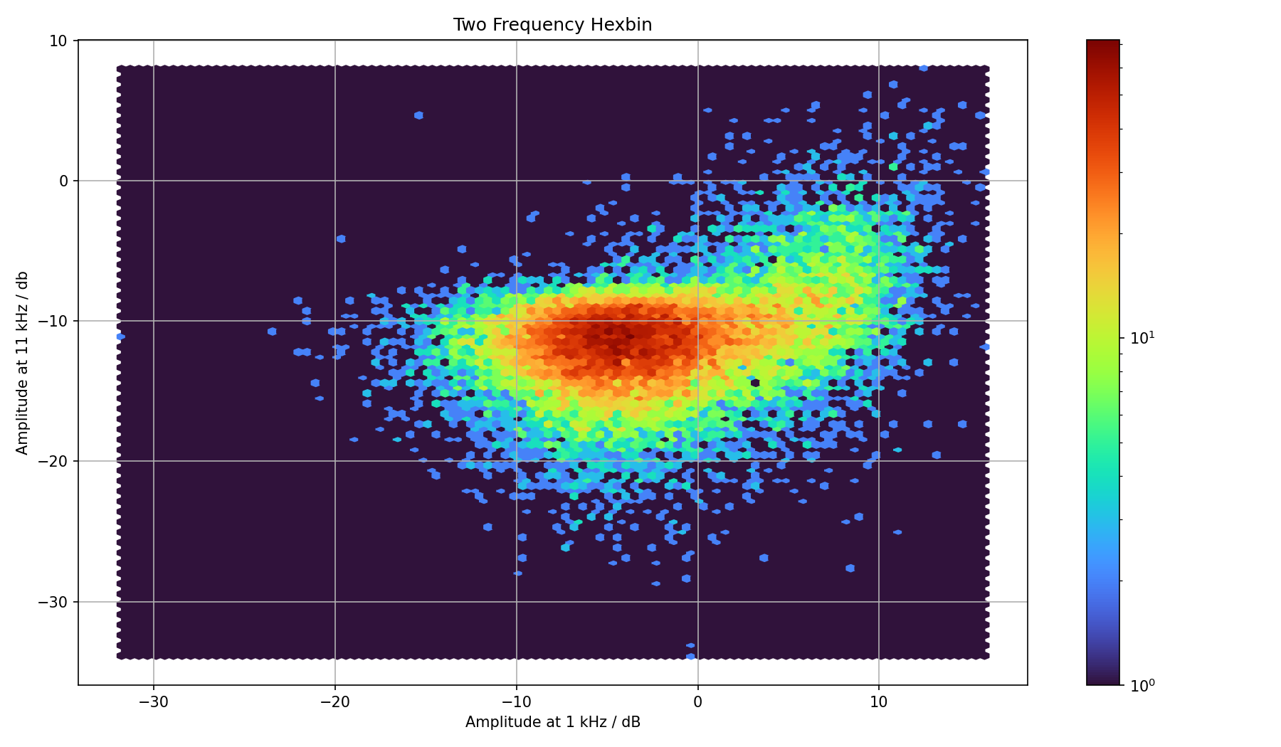
We can first take a look at the type of result that might come out of this. In the above manual feature extraction we have seen that there are a couple of promising frequencies. I had used 2.5, 7, 9 and 11 kHz. We can just perform a scatter plot of two such frequencies. But because there will be a lot of overlap, I instead bin the data. And because hexagons are the bestagons we use hexagonal bins. Taking for instance 9 and 11 kHz gives us this plot:
Both frequencies were pretty good for finding passing cars, so I expect some correlation between them. Let us interpret that image. There is a huge cluster of observations where the amplitudes of both frequencies are just below –10 dB. This likely is the silence region.
On the plots with the peaks we see that the peaks are somewhere between –8 to –4 dB. In the plot we can see this green cluster to the upper right. It is expected that it is not clearly separated from the silence region.
We can also take another frequency, 1 kHz, which didn't prove that helpful. In that plot we have the same vertical axis, but the horizontal is different. And although there is a bend, it doesn't look that helpful.
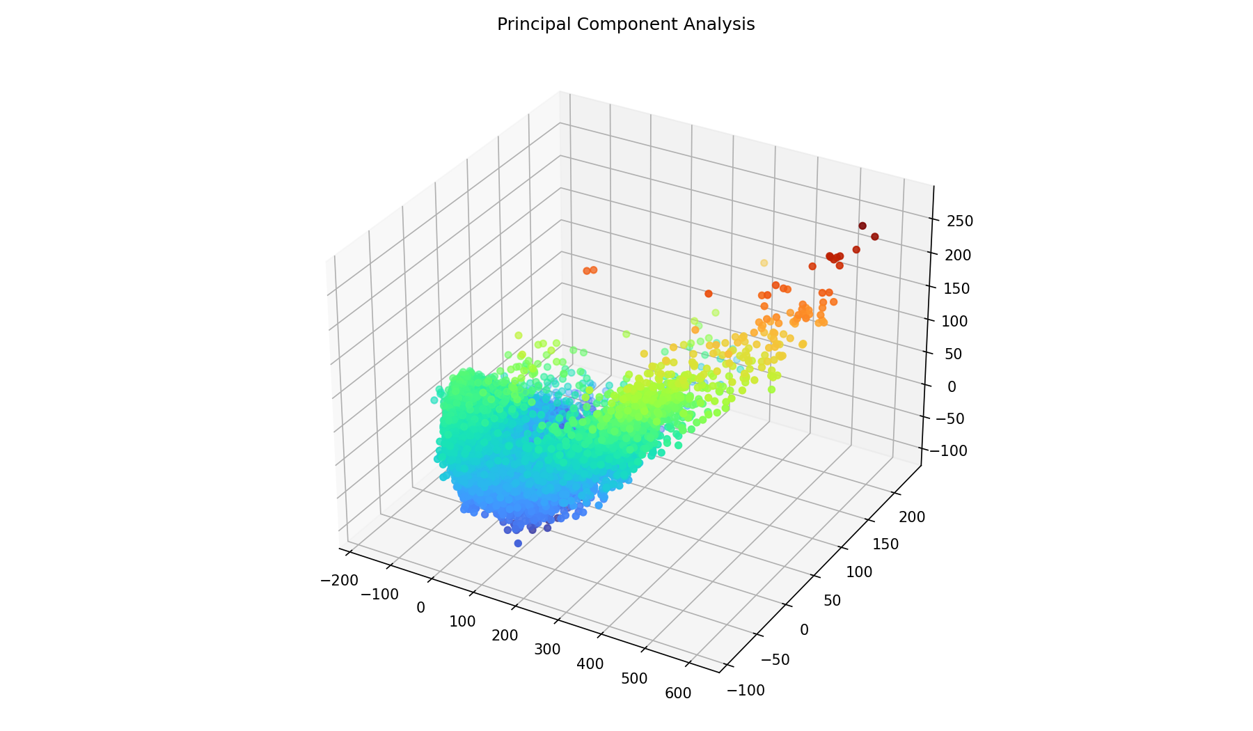
And we can combine three frequencies into a 3D scatter plot, but that becomes really useless without interactivity. Colors encode one of the components to give the image some depth, they are not density estimates.
Principal Component Analysis
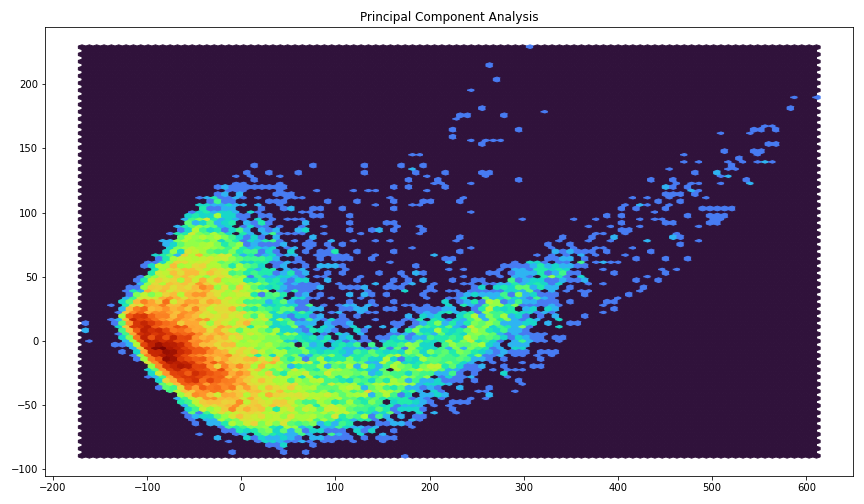
We can use the principal component analysis in order to reduce the number of dimensions to a much smaller dimension. I just put in all frequencies and see what it can come up with.
pca = sklearn.decomposition.PCA(2)
db_reduced = pca.fit_transform(db.T)
The resulting data is reduced to just two components, we can easily plot that:
I would hope that this extension to from the lower part to the upper right are exactly the passing cars.
We can also do this with three principal components, but then the plotting becomes difficult again. Colors encode one of the components to give the image some depth, they are not density estimates.
Cut in principal components
I have chosen all the points where the first principal component is over 150. Then I have plotted this selection just below the a section of the spectrogram. It seems that this finds the car passes pretty well.
One could now improve on the mask by making sure that it is contigious for at least a few seconds. But it looks promising.
Single principal component
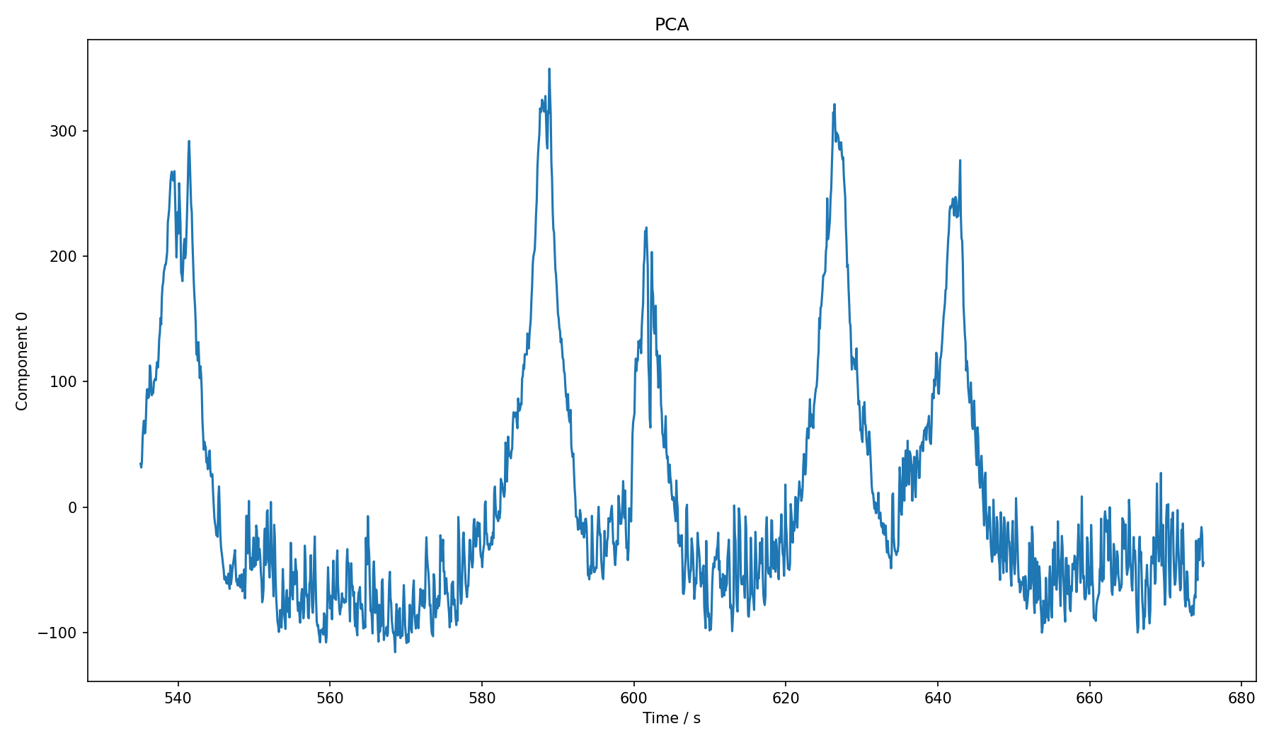
Perhaps it would be possible to reduce the data to just one principal component? When I did the cut in 2D, I only cut along the first component anyway. So how would that look over time?
That looks pretty much like the peaks in the above spectrum graph, though that is a coincidence. It seems that we could use this instead of a single frequency. With a bit of Gaussian smoothing it might give a better signal than just picking one of the frequencies manually.
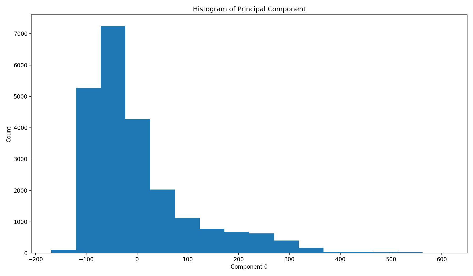
In a histogram we don't see a secondary peak, but this is what we would expect. We could just cut at around 100 or 150 and take everything to the right as being a car that passes by.
Conclusion
Identifying the passing cars seems to be easy enough. There might be a few false-positives, but in general it seems doable. Approaches based on thresholds can be confused by sufficiently loud noises. The presented solutions cannot really classify noises.
In order to have a more robust classification, it seems necessary to have annotated training data. One would have to have observations for cars and other typical noises. These could be fed into a deep convolutional or recurrent network to train it to classify different noises. The problem is the creation of the training set, which does not sound nearly as fun as playing with the data.
There are lots more ways to process signals, after looking a bit into it I have the feeling that I barely scratched the surface. Also one could try to improve the audio recording itself, using a better microphone, record directly on street level, and so on.
